We got the opportunity to submit names and logo creations for a bicycle sharing venture in my home town. We jumped at the chance. Charged with generating names and brand identity for a very visible and impacting brand is a triple win for us. We dove right in to defining the competition.
Lime Scooters was really the only local competition, and a nice Brand Identity for sure. Our efforts focused on a brand that would jump out of that market and be noticed from day one.
Audience
Trying to reach married couples, both with and without children, we wanted a bright message of ecological responsibility and active entertainment for the whole family as well as an economical means of commuting to and from work without the traffic jams.
Playing with color messages
Exploring multiple color schemes and genres, we developed several mood boards to gain some insight to what we really wished to present. The play was good for us.
Three names made the short list.
Pedal - A simple action word that can be paired with the name of any city, i.e. - pedal Tulsa. Sometimes confused with petal which lends to the eco friendly nature of this venture.
Byk - An alternate spelling of the word Bike. Adding a little edge to the name, but still stating what it is, byk looks unique but still familiar.
Spokes - Spokes has several connotations. Spokes of a wheel, spokes person, etc. The name seems to fit into the vocabulary fairly easily as a noun. For instance, “Lets go get a Spokes and ride to the Gathering Place”
byk was chosen with an altered color palate.
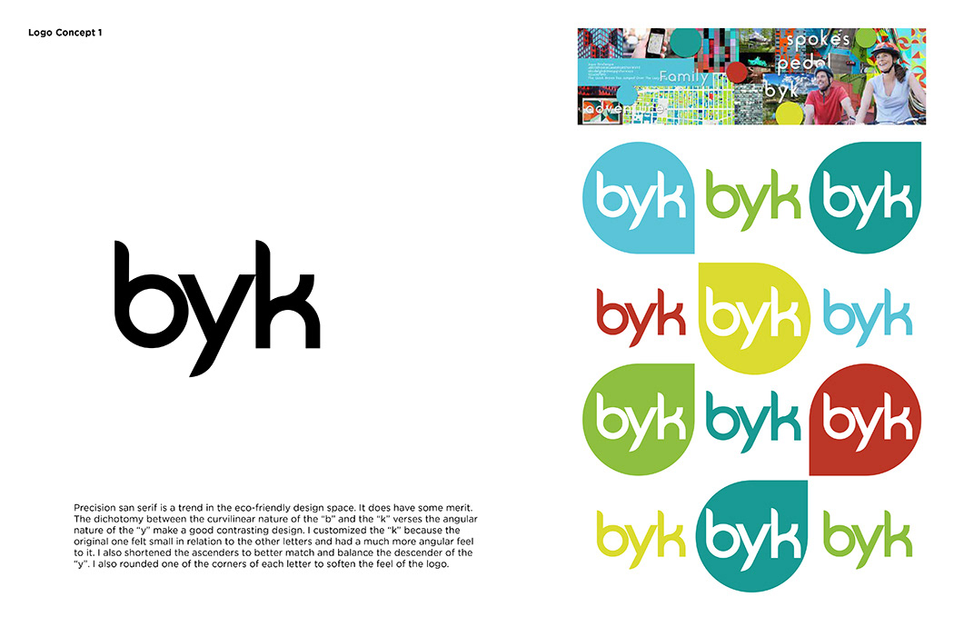
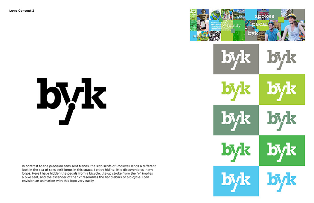
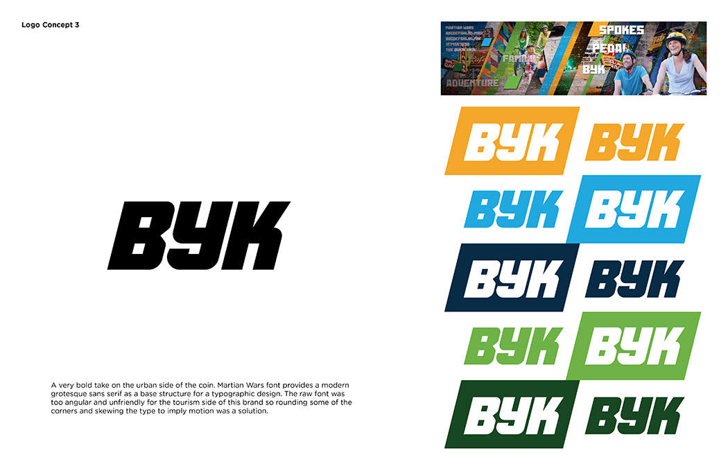
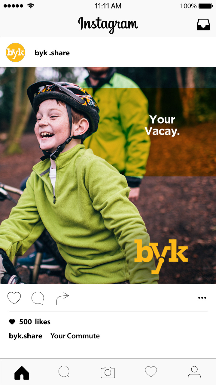
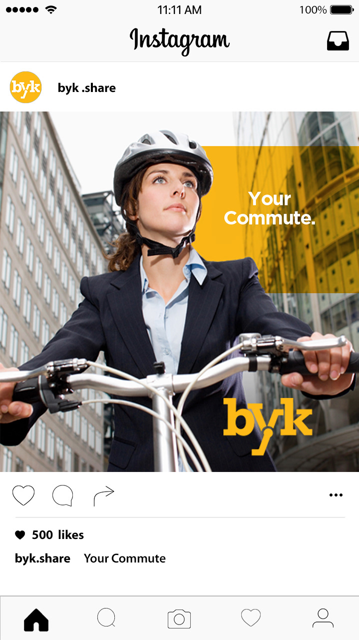
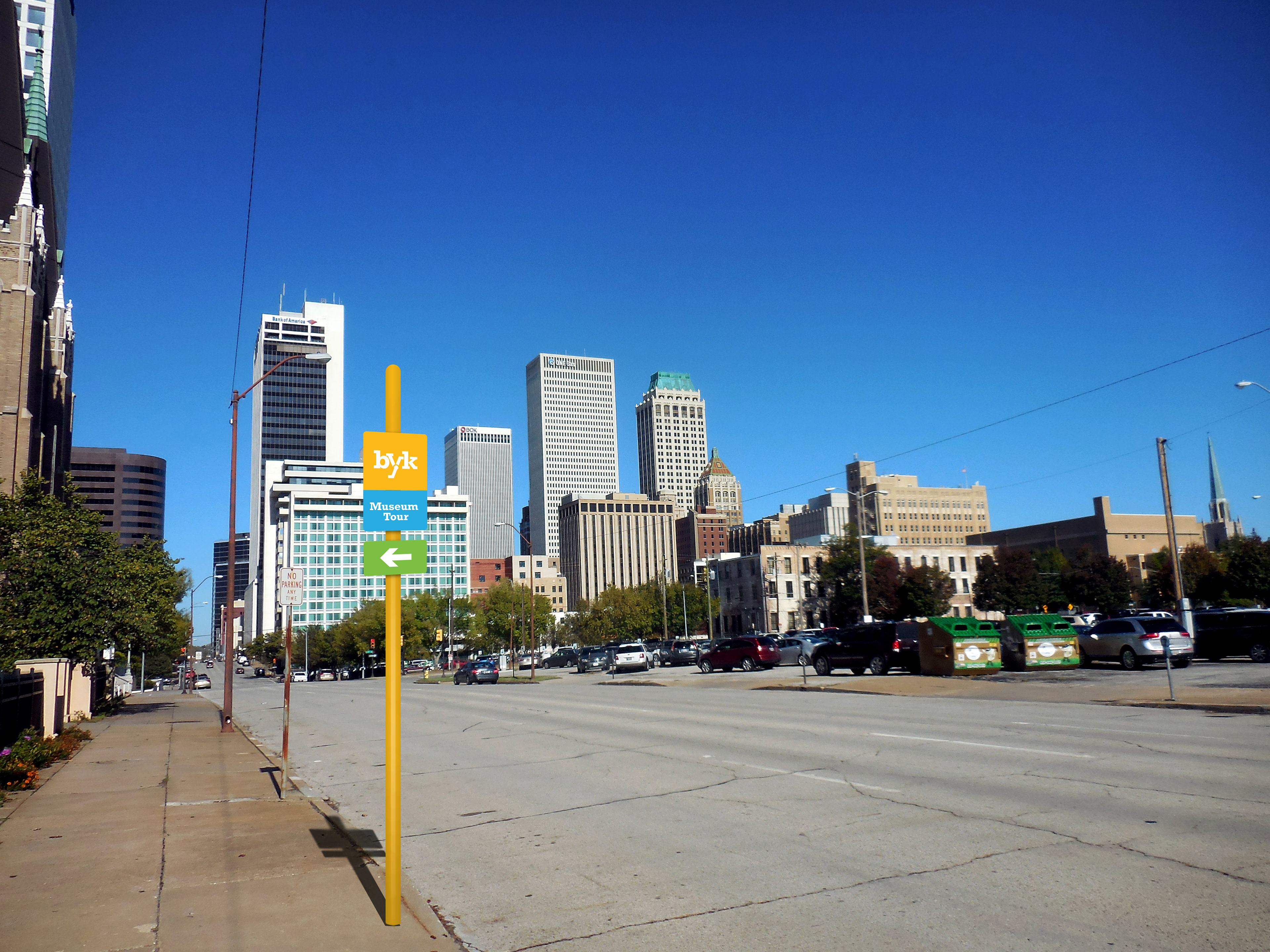
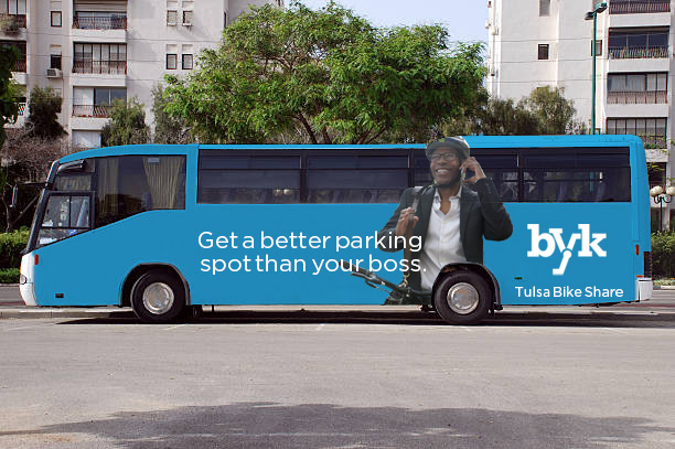
We proceeded to hone the identity and apply it to various requested placements.
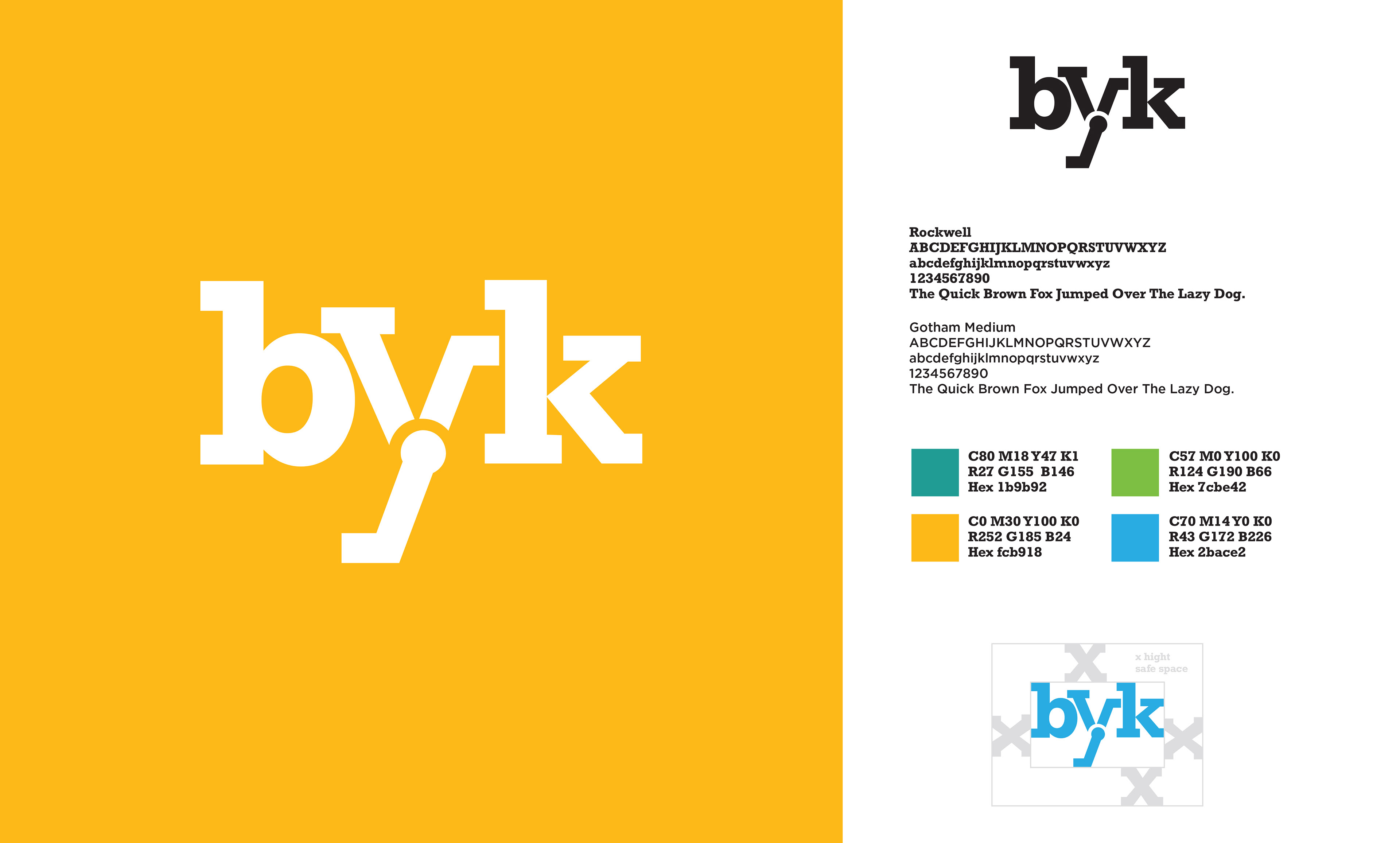
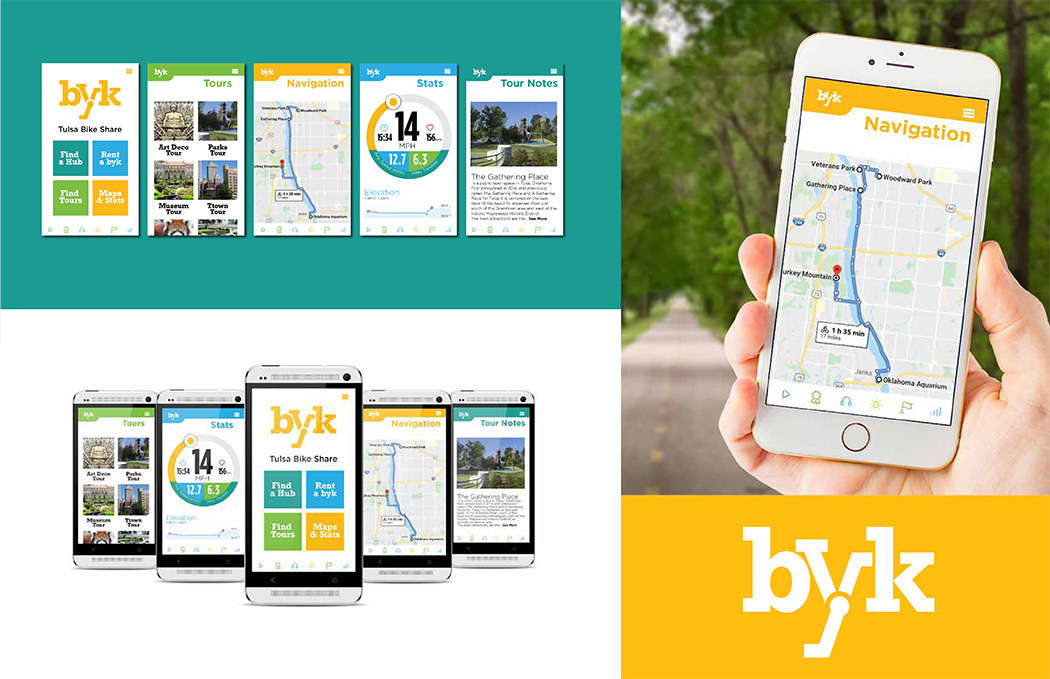

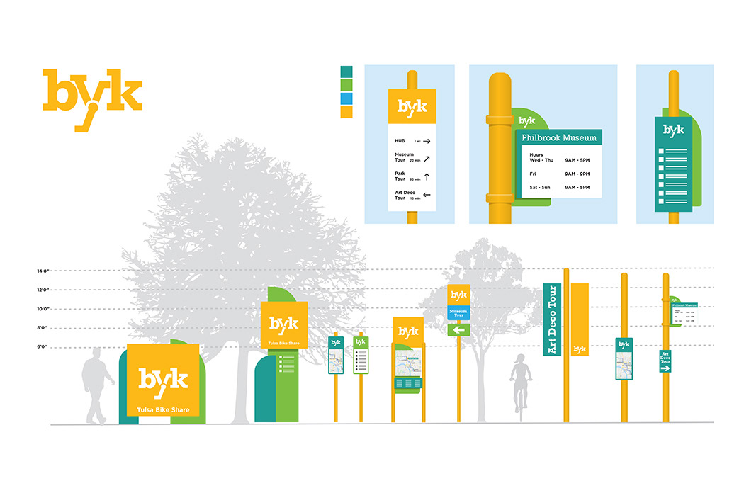
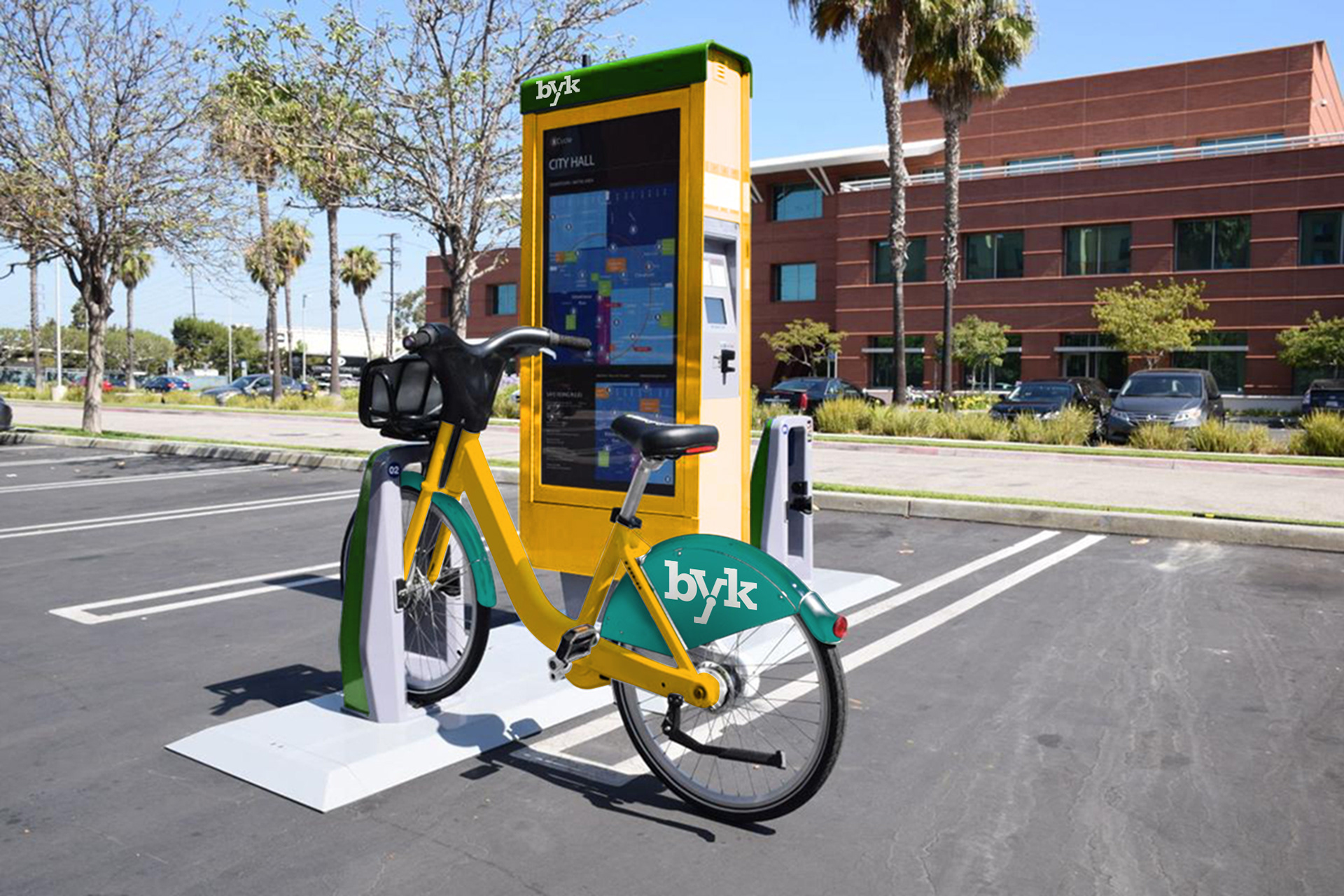
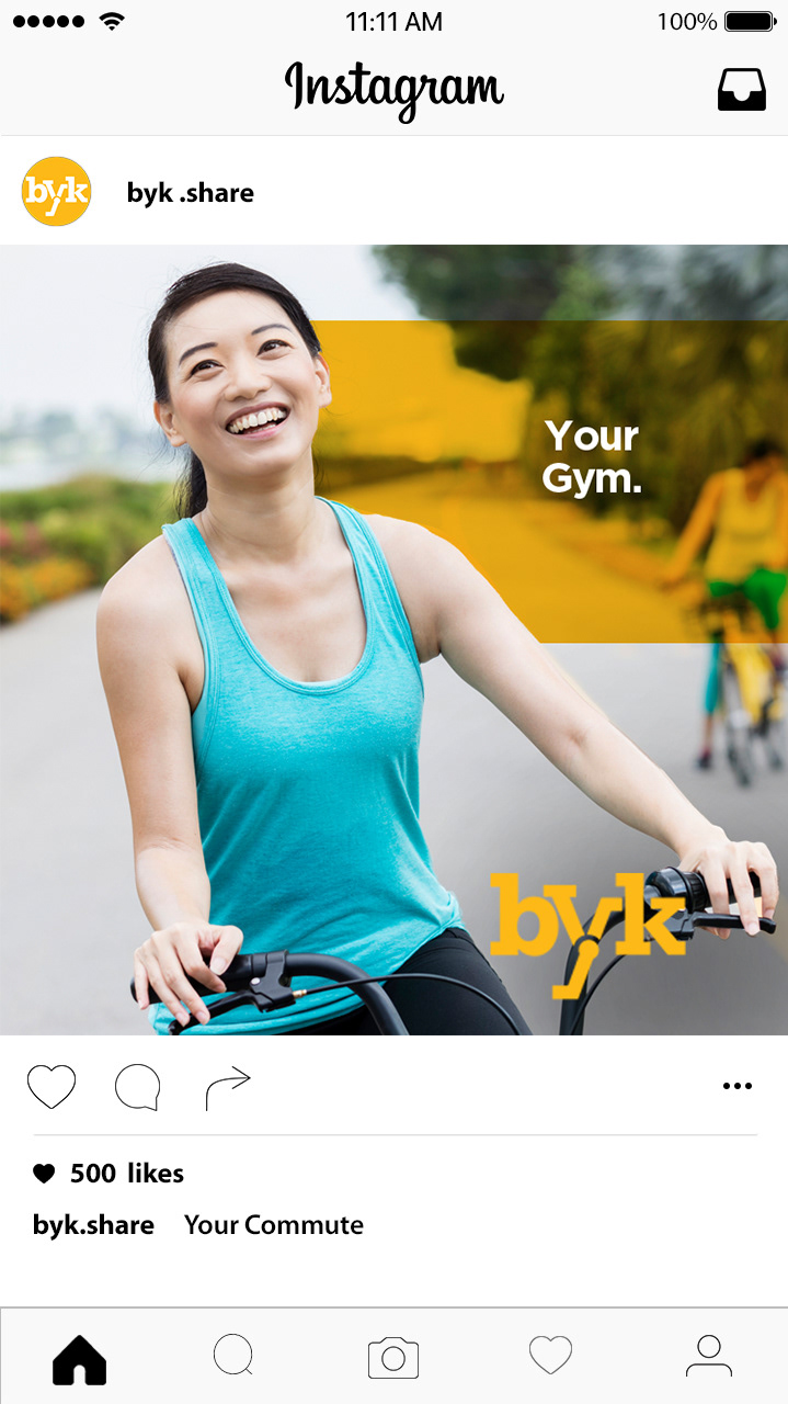

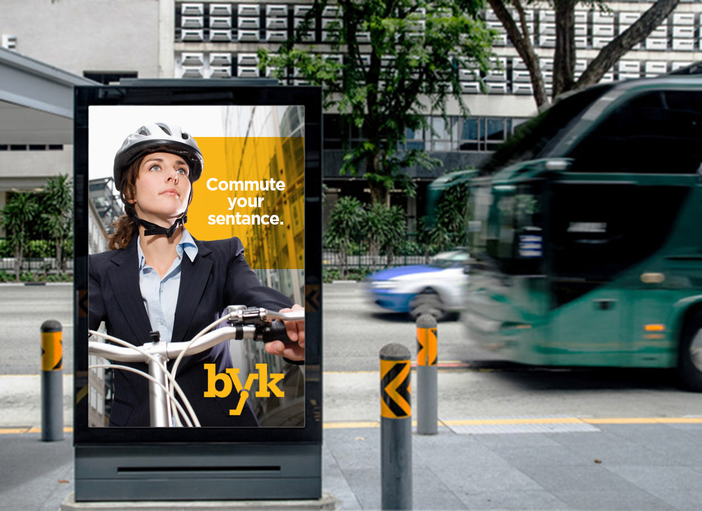

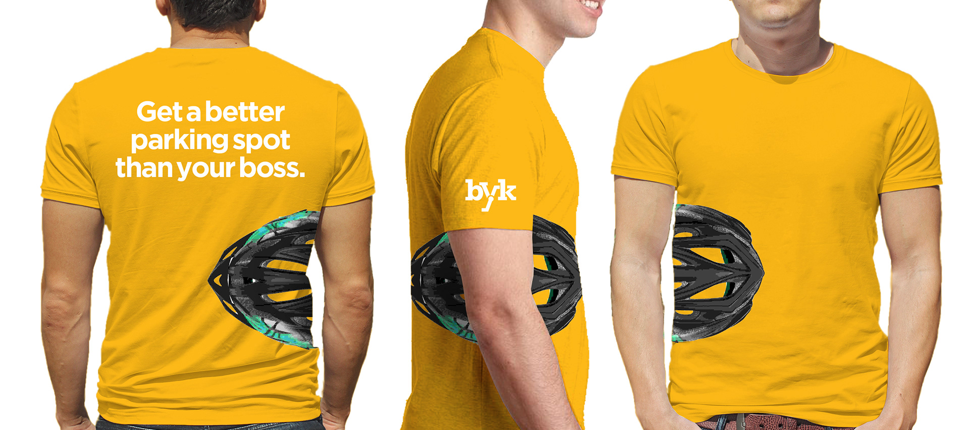
Overall, we are very happy with the outcome, and it seems to have been a big hit.
